A pavilion at the landscape architecture union convention
\\
Aims and strategy
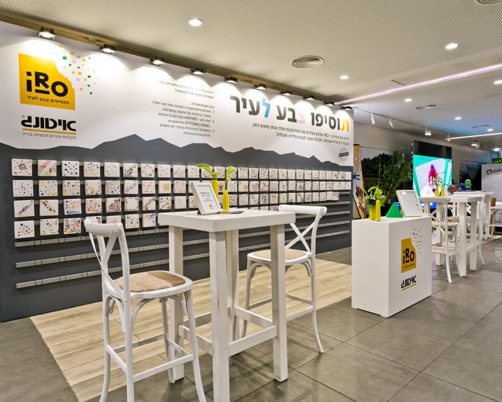
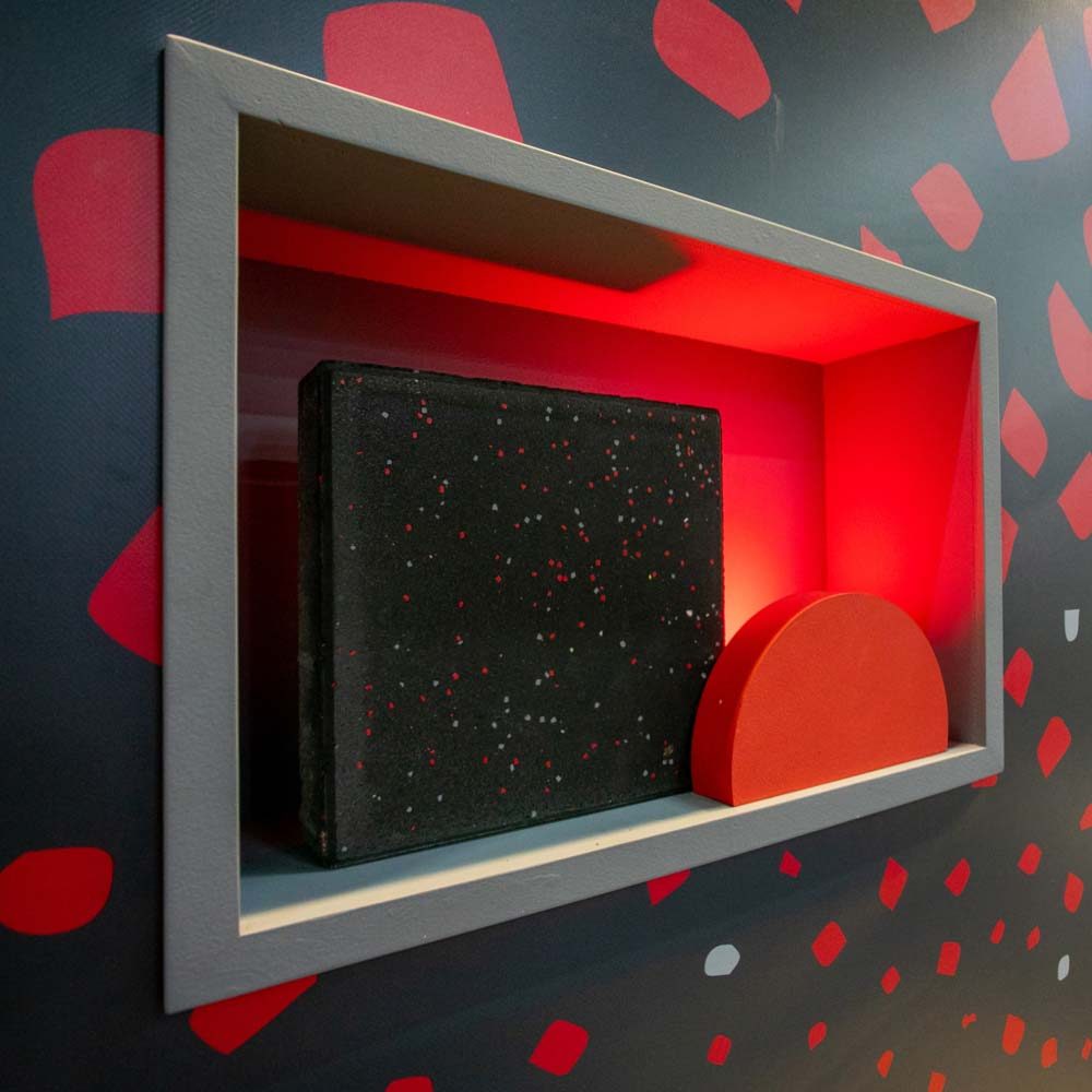
IRO (Japanese for color) is a collection of intertwining stones that enable a dynamic application of color flakes personalized by a RAL color catalog. Ytong has chosen us to brand, plan, and create a launch centered around an experiential area for a professional audience at the landscape architecture union convention. To create this experiential launch and express the uniqueness of the product we have decided to embed it in two levels: the physical level as an integral part of the pavilion design, and the experiential level as creating interaction by gamifying the experience. The guests were invited to create their cardboard tile, just like in real life, and then present it and photograph it to participate in an award-winning competition with loads of tagging on social media.
\\
Design
The meaning of the word IRO in Japanese is color, and in our naming, branding, and designing process, we’re creating a sustainable connection with interfacing content fields. This time, for the IRO launch, we have designed the campaign, branding, and pavilion under inspiration we have drawn from the Japanese artist Yayoi Kusama, whose iconic works are easily recognized by the comprehensive color patches, very similar to the product Ytong is launching. The pavilion has brought to life the meaning and influence of color and our collective wish to bring optimism and life to our too-common greyish public spaces in Israel.
\\
Solution
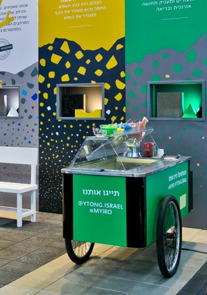
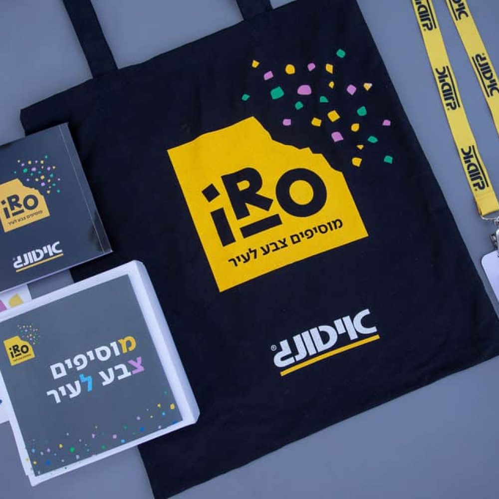
The premiumization processes lean on developing a product while creating precise and experiential storytelling, one that will inspire the user and link them to other fields of content. For Ytong, we have created a four-phase journey for the client. In the first phase, sending out a survey about the meaning of color in public spaces to a community of architects, designers, and entrepreneurs. During the second phase, we personally invited them to the experiential pavilion and launched the new line of products. The third phase consisted of the product experience that was spread over three separate areas in the pavilion. It included a demo, a competition, and an urban ice cream shop that held flavors relating to the colors of the product. The fourth phase was past the event: award-winning competition, receiving a unique value and presenting the guests and their offices with tools for organic promotion on social media.

